# swiper
swiper很多时候,我们可能只用到了它的10%b不到的功能,显然是不划算的,也会有性能方面的顾虑
随着CSS的不断发展,现场纯CSS也几乎能够实现这样一个swiper了,实现更加简单,更加清凉,性能也更好,完全足够日常使用,最近在项目中也碰到了一个swiper需求,刚好练一下 一起看看
# 一、css滚动吸附
swiper有个最大的特征就是滚动吸附。相信很多同学已经想到了,那就是CSS scroll snap,这里简单介绍一下
看似属性很多,其实CSS scroll snap最核心的概念有两个,一个是scroll-snap-type,还一个是scroll-snap-align,前者是用来定义吸附的方向和吸附程序的,设置【滚动容器】上,后者用来定义吸附点的对齐方式的,设置在【子元素】上
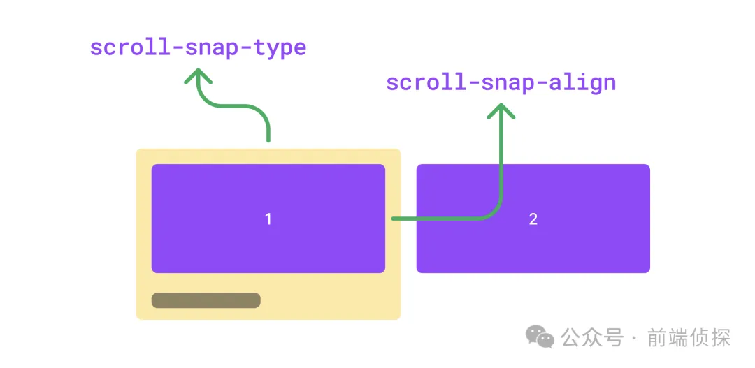
有了这两个属性,就可以轻松的实现滚动吸附效果了,下面举个例子
<div class="swiper">
    <div class="swiper-item">
        <div class="card"></div>
    </div>
    <div class="swiper-item">
        <div class="card"></div>
    </div>
    <div class="swiper-item">
        <div class="card"></div>
    </div>
</div>
简单修饰一下,让swiper可以横向滚动
.swiper {
diplay: flex;
overflow: auto;
}
.swiper-item {
width: 100%;
display: flex;
justify-content: center;
flex-shrink: 0
}
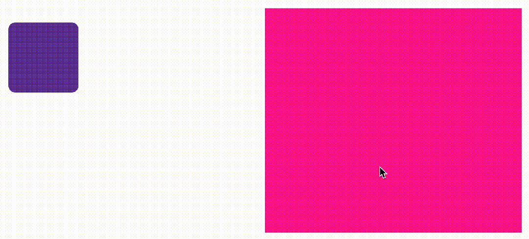
.card {
width: 300px;
height: 150px;
border-radius: 12px;
background-color: #9747ff;
}
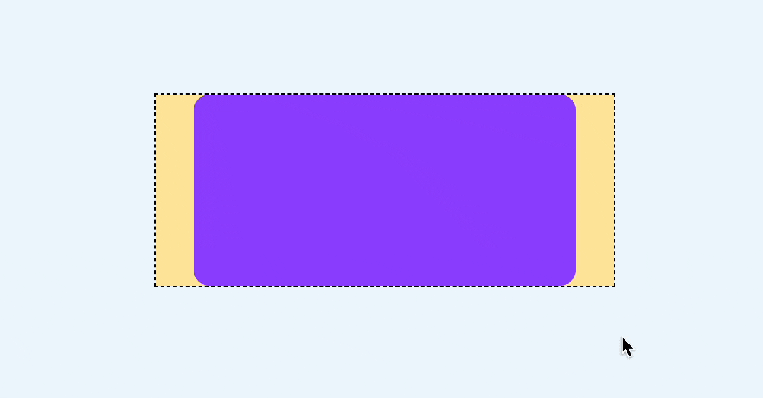
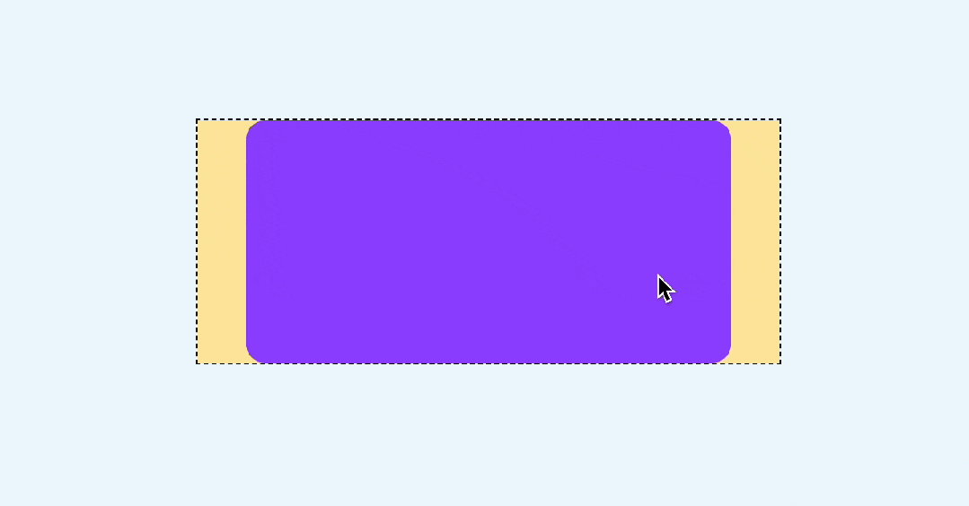
效果如下
然后加上scroll-snap-type 和 scroll-snap-align
.swiper {
    scroll-snap-type: x mandatory;
}
.swiper-item {
    scroll-snap-align: center;
}
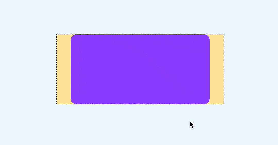
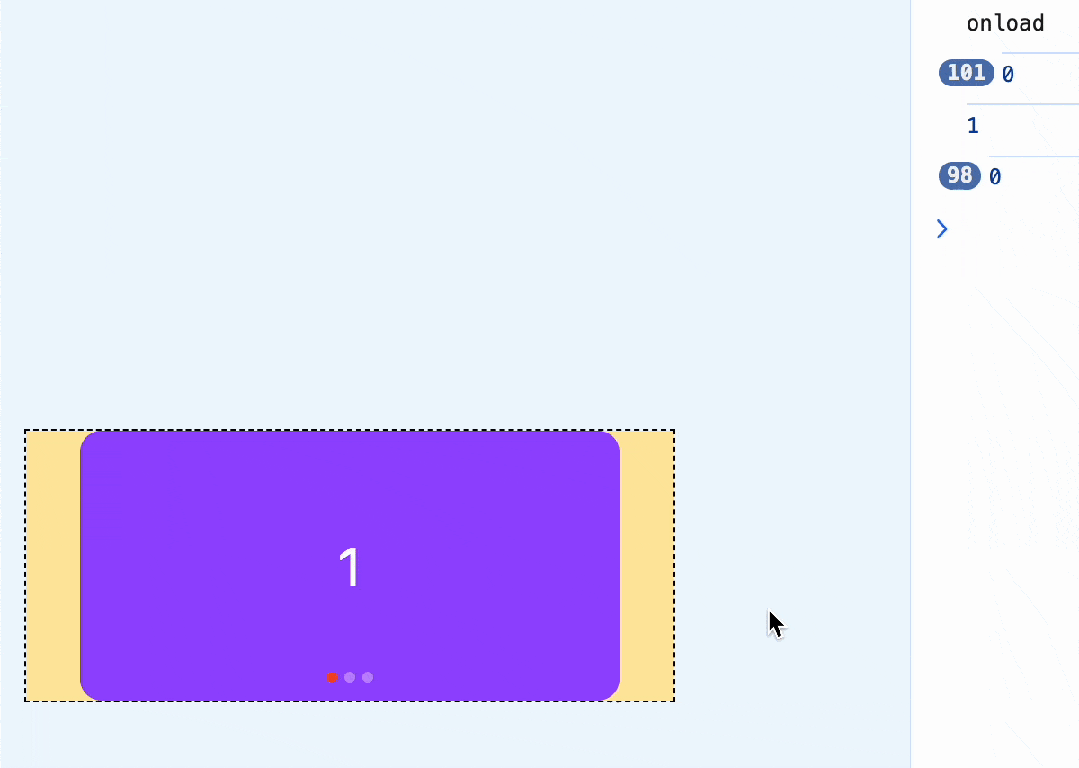
这样就能实现滚动吸附了
注意这里还有一个细节,如果滑动的非常快,是可以从第一个直接滚动到最后一个的,就像这样
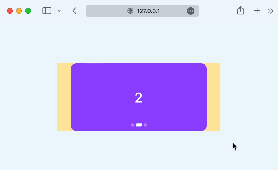
如果不想跳过,也就是每次滑动只会滚动一屏,可以设置scroll-snap-stop属性,它可以决定是否"跳过"吸附点,默认是normal,可以设置为always,标识每次滚动都会停止在最近的一个吸附点
.swiper-item {
    scroll-snap-align: center;
    scroll-snap-stop: always;
}
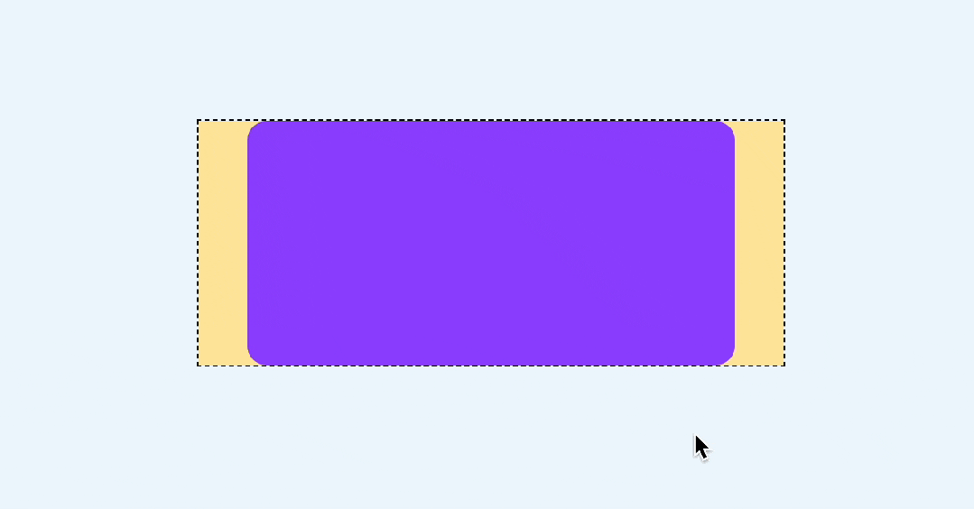
这样无论滚动有多快,都不会跳过任何一屏了
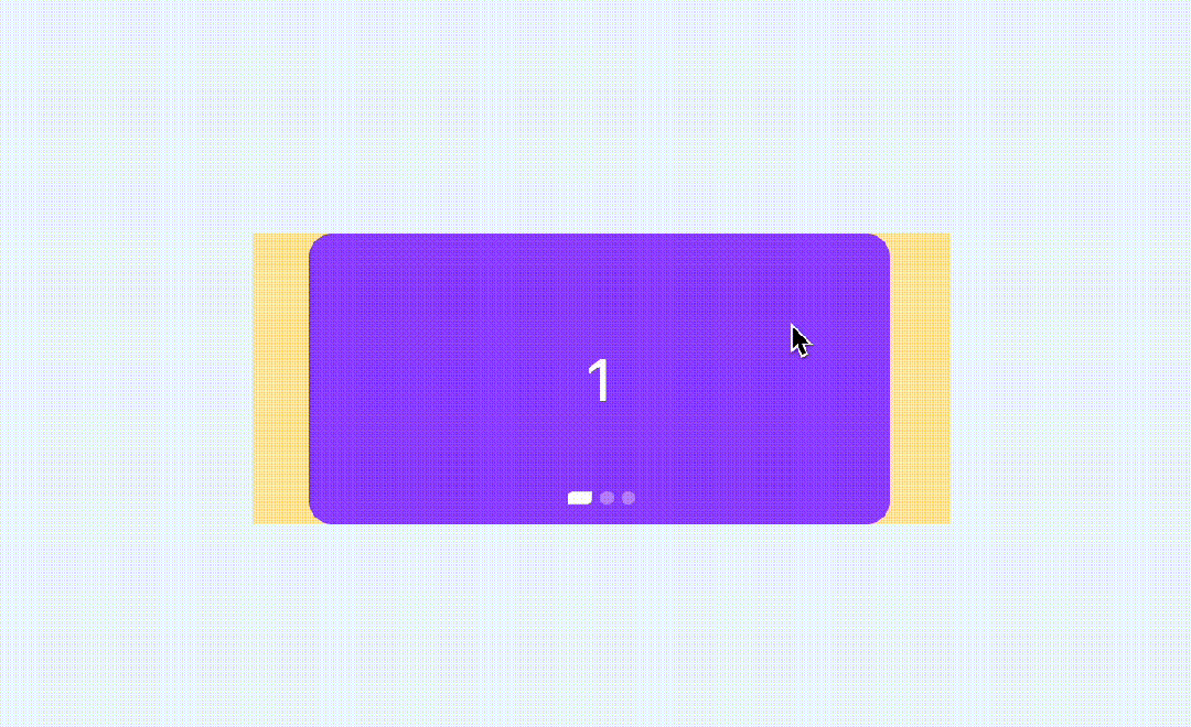
还有一点,现在是有滚动条的,显然是多余的
这里可以用 ::webkit-scrollbar 去除滚动条
::-webkit-scrollbar {
    width: 0;
    height: 0
}
如果在某些移动端无效,可以参考之前这篇文章,有更多的解决办法
裁剪的3种方式,CSS 如何隐藏移动端的滚动条? (opens new window)
滑动基本上就这样了,下面来实现比较重要的指示器
# 二、CSS滚动驱动动画
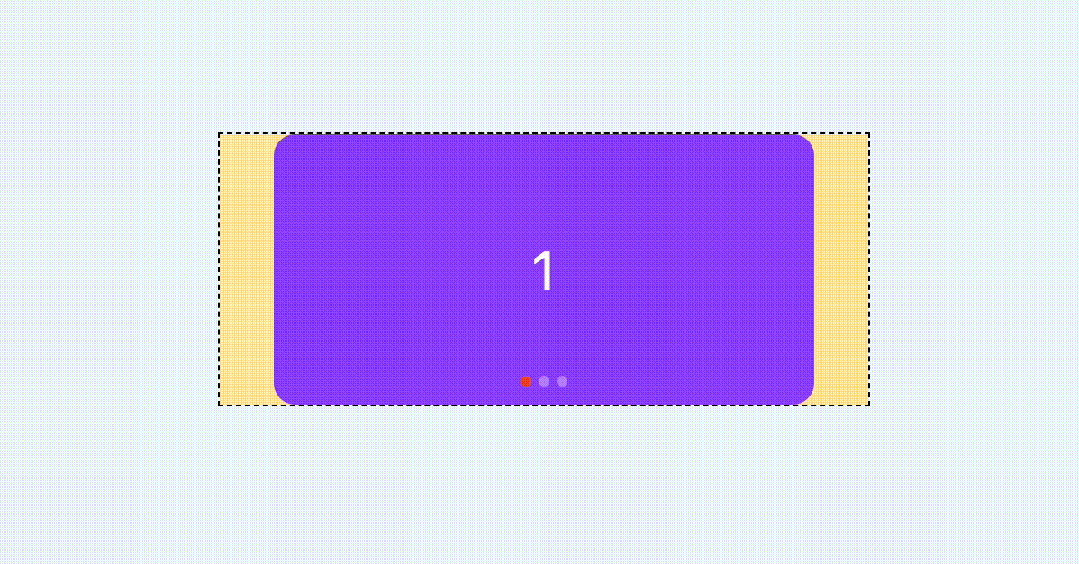
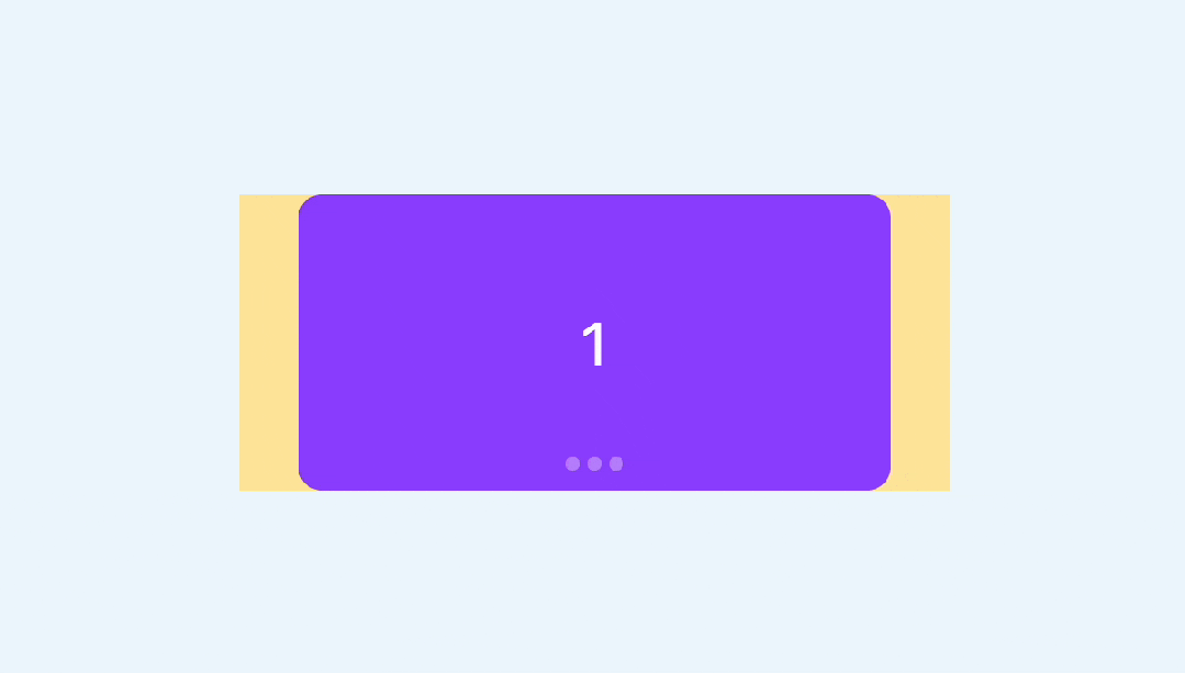
首先我们加几个圆形的指示器
<div class="swiper">
  <div class="swiper-item">
    <div class="card"></div>
  </div>
  <div class="swiper-item">
    <div class="card"></div>
  </div>
  <div class="swiper-item">
    <div class="card"></div>
  </div>
  <!--指示器-->
  <div class="pagination">
    <i class="dot"></i>
    <i class="dot"></i>
    <i class="dot"></i>
  </div>
</div>
.pagination {
  position: absolute;
  display: inline-flex;
  justify-content: center;
  bottom: 10px;
  left: 50%;
  transform: translateX(-50%);
  gap: 4px;
}
.dot {
  width: 6px;
  height: 6px;
  border-radius: 3px;
  background: rgba(255, 255, 255, 0.36);
  transition: 0.3s;
}

那么,如何让下方的指示器跟随滚动而变化呢?
这就需要用到 CSS 滚动驱动动画了,关于这个特性,可以参考之前这篇文章
CSS 滚动驱动动画终于正式支持了~ (opens new window)
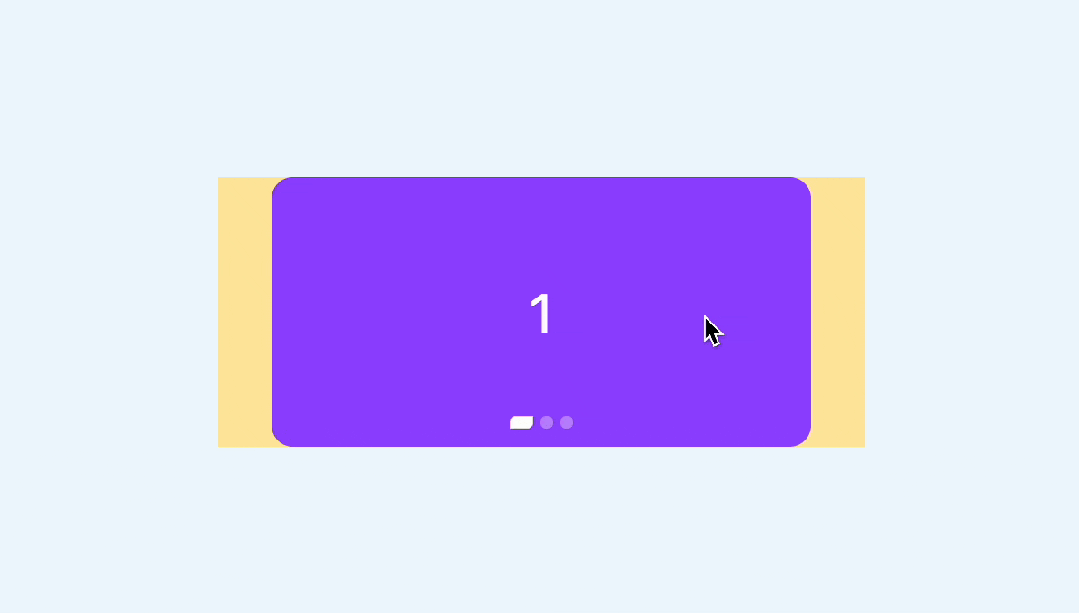
在这里,我们可以再单独绘制一个高亮的状态,刚好覆盖在现在的指示器上,就用伪元素来代替
.pagination::before {   234
    content: ' ';
    position: asbolute;
    width: 6px;
    height: 6px;
    border-radius: 3px;
    background-color: #f24822;
    left: 0;
}
效果如下

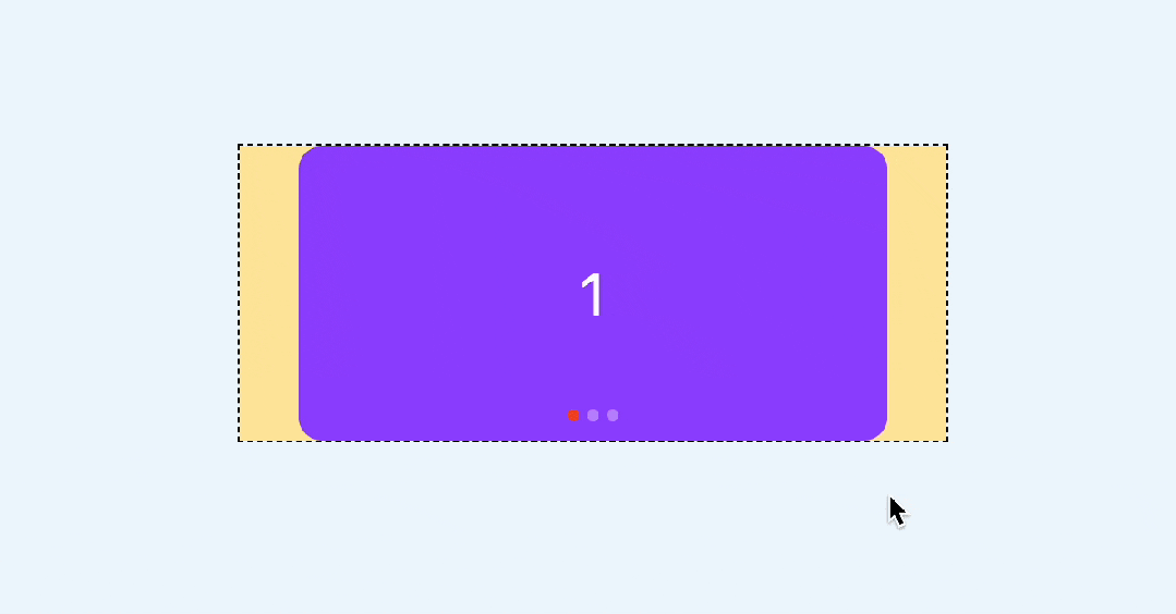
然后给这个高亮状态一个动画,从第一个指示器移动到最后一个
.pagination:after {
    animation: move 3s linear forwards;
}
@keyframes move {
    to{
        left: 100%;
        transform: translateX(-100%);
    }
}
现在这个红色的圆会自动从左到右运动,效果如下
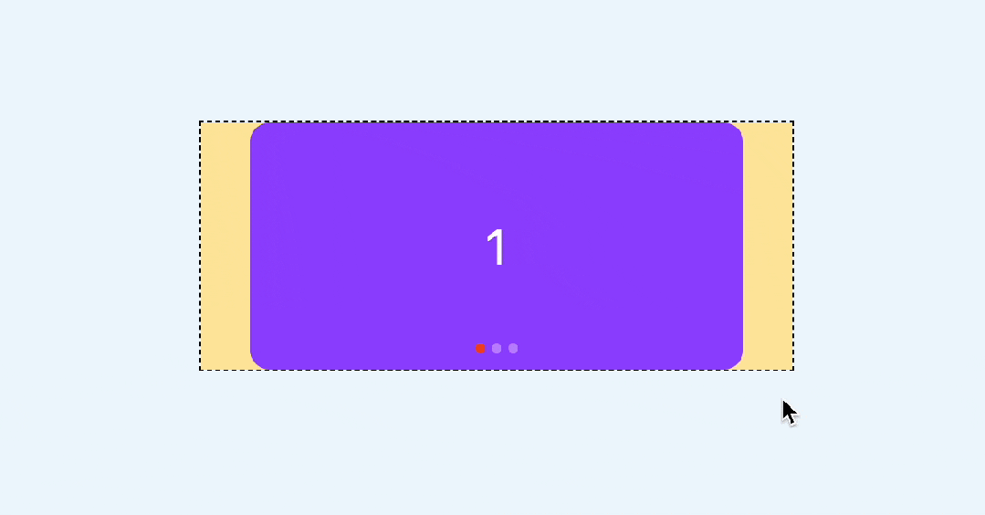
最后,让这个动画和滚动关联起来,也就是滚动多少,这个红色的圆就运动多少
.swiper {
    scroll-timeline: --scroller x;
}
.pagination::after {
    animation: move 3s linear forwards;
    animation-timeline: --scroller;
}
这样就基本实现了指示器的联动
当然,你还可以换一种动画形式,比如steps
.pagination::after {
    animation: move 3s steps(3, jump-none) forwards;
    animation-timeline: --scroller;
}
效果如下
你也可以访问一下在线demo
CSS swiper (juejin.cn) (opens new window)
# 三、CSS时间线范围
上面的指示器实现其实是通过覆盖的方式实现的,这就意味着无法实现这种有尺寸变化的效果,例如:

这种情况下,每个指示器的变化是独立的,而且尺寸变化还会相互挤压
那么,有没有办法实现这样的效果呢?当然也所有的,需要用到css时间线范围,也就是 timeline-scope
https://developer.mozilla.org/en-US/docs/Web/CSS/timeline-scope (opens new window)
这是什么意思呢?默认情况下,CSS滚动驱动作用范围只能影响到子元素,但是通过 timeline-scope,可以让任意元素都可以收到滚动驱动的影响。简单举个例子
<div class="content">
  <div class="box animation"></div>
</div>

<div class="scroller">
  <div class="long-element"></div>
</div>
这是两个元素,右边的是滚动容器,左边的是一个可以旋转的矩形

我们可以在他们共同的父级,比如body定义一个timeline-scope
body{
  timeline-scope: --myScroller;
}
然后,滚动容器的滚动和矩形的动画就可以通过这个变量关联起来了
.scroller {
    overflow: scroll;
    scroll-timeline-name: --myScroller;
    background: deepink;
}
.animation {
    animation: rotate-appear:
    animation-timeline: --myScroller;
}
效果如下
我们回到这个例子中来,很明显每个卡片对应一个一个指示器,但是他们从结构上又不是包含关系,所以这里也可以给每个卡片和指示器一个相关联的变量,具体实现如下
<div class="swiper-container" style="timeline-scope: --t1,--t2,--t3;">
  <div class="swiper" style="--t: --t1">
    <div class="swiper-item">
      <div class="card">1</div>
    </div>
    <div class="swiper-item" style="--t: --t2">
      <div class="card">2</div>
    </div>
    <div class="swiper-item"  style="--t: --t3">
      <div class="card">3</div>
    </div>
  </div>
  <div class="pagination">
    <i class="dot" style="--t: --t1"></i>
    <i class="dot" style="--t: --t2"></i>
    <i class="dot" style="--t: --t3"></i>
  </div>
</div>
然后,给每个指示器添加一个动画
@keyframes move {
    50% {
        width: 12px;
        border-radius: 3px 0px;
        border-color: rgba(0, 0,0, 0.12);
        background: #fff;
    }
}
效果如下
然后我们需要将这个动画和卡片的滚动关联起来,由于是需要监听卡片的位置状态,比如只有第二个出现在视区窗口范围内时,第二个指示器才会变化,所以这里要用到 view-timeline,关键实现如下
.swiper-item {
    view-timeline:var(--t) x;
}
.dot {
    animation: move 3s;
    animation-timeline: var(--t);
}
这样就实现了我们想要的效果
你也可以访问以下在线demo
CSS swiper timeline scope (juejin.cn)[2] (opens new window)
# 自动播放
由于是页面滚动,CSS无法直接控制,所以要换一种方式。通过我们会借助JS定时器实现,但是控制比较麻烦
还记得之前这篇文章吗?
还在用定时器吗?借助 CSS 来监听事件 (opens new window)
没错,我们这里也可以用这个原理实现。
给容器定义一个无关紧要的动画
.swiper {
    animation: scroll 3s infinite;
}
@keyframes scroll {
    to {
        transform: opacity: .99
    }
}
然后监听animationiteration事件,这个事件表示每次动画循环就触发一次,也就相当于每3秒执行一次
swiper.addEventListener('animationiteration', ev => {
    // 轮播逻辑
    if(ev.target.offsetWidth + ev.target.scrollLeft >= ev.target.scrollWidth) {
        // 滚动到最右边直接回到0
        ev.target.scrollTo({
            left: 0,
            behavior: 'smooth'
        })
    } else {
        // 每次滚动一屏
        ev.target.scrollBy({
            left: ev.target.offsetWidth,
            behavior: 'smooth'
        })
    }
})
相比定时器的好处就是,可以直接通过CSS控制播放和暂定,比如我们要实现当鼠标房子啊轮播上是自动暂停,可以这样来实现,副作用更小
swiper:hover,.swiper:active {
    animation-play-state: paused;
}
最终效果如下
demo
CSS swiper autoplay (juejin.cn) (opens new window)
# 回调事件
swiper很多时候不仅仅只是滚动,还需要有个回调事件,以便于其他处理。这里由于是滚动实现,素以有必要监听scroll事件。
实现很简单,只需要监听滚动便宜和容器本身的尺寸就可以了,具体实现如下
swiper.addEventListener('scroll', (ev) => {
    const index =  Math.floor(swiper.scrollLeft / swiper.offsetWidth)
    console.log(index)
})
效果如下
你可能觉得出发次数太多了,我们可以限制一下,只有改变的时候才触发
swiper.addEventListener('scroll', (ev) => {
    const index = Math.floor(swiper.scrollLeft / swiper.offsetWidth)
    // 和上次不相同的时候才打印
    if(swiper.index !== index) {
        swiper.index = index;
        console.log(index);
    }
})

还可以继续优化,当滑动超过一半时,就认为已经滑到了下一个卡片了,只需要在原有基础上加上0.5就行了
swiper.addEventListener('scroll', (ev) => {
    const index = Math.floor(swiper.scrollLeft / swiper.offsetWidth + 0.5);
    if (swiper.index!== index) {
        swiper.index = index
        console.log(index)
    }
})
如果在vue这样的框架里,就可以直接这样实现了
const current = ref(0);
const scroll = (ev: Event) => {
    const swiper = ev.target.as HTMLDivElement;
    if(swiper) {
        current.value = Math.floor(swiper.scrollLeft / swiper.offsetWidth + 0.5);
    }
}
const emits = defineEmits(['change']);
watch(current, v => {
    emits('change', v);
})
# 兼容性处理
前面提到的CSS滚动驱动动画兼容性不是很好,需要Chrome 115+,所以对于不支持的浏览器,你也可以用监听回调事件的方式来实现指示器联动,就像这样
swiper.addEventListener('scroll', (ev) => {
    const index = Math.floor(swiper.scrollLeft / swiper.offsetWidth + 0.5);
    if(swiper.index !== index) {
        swiper.index = index;
        console.log(index);
        if(!CSS.supports('animation-timeline', 'scroll()')) {
            document.querySelector('.dot[data-current="true"]').dataset.current = false
            document.querySelectorAll('.dot')[index].dataset.current = true
        }
    }
})
对于 CSS部分,还需要用CSS support判断一下,这样一来,不支持浏览器就不会自动播放动画了
@supports (animation-timeline: scroll()) {
  .dot{
    animation: move 1s;
    animation-timeline: var(--t);
  }
}
@supports not (animation-timeline: scroll()) {
  .dot[data-current="true"]{
    width: 12px;
    border-radius: 3px 0px;
    border-color: rgba(0, 0, 0, 0.12);
    background: #fff;
  }
}
这样既使用了最新的浏览器特性,又兼顾了不支持的浏览器,下面是Safari的效果
对比一下支持 animation-timeline的浏览器(chrome 115+)
 你会发现,这种效果更加细腻,指示器是完全跟随滚动进度变化的
# 总结
做好兼容,CSS也是可以尝试最新特性的,下面总结一下要点
- swiper非常强大,我们平时可能只用到它的10%不到的功能,非常不划算
- CSS发展非常迅速,完全可以借助CSS替代部分swiper
- 滚动吸附比较容易,需要借助CSS scroll snap完成
- 指示器联动可以用 css滚动驱动 动画 实现,让指示器唯一动画和滚动关联起来,也就是滚动多少,指示器就偏移多少
- 默认情况下,CSS 滚动驱动作用范围只能影响到子元素,但是通过timeline-scope,可以让任意元素都可以受到滚动驱动的影响。
- 利用timeline-scope,我们可以将每个卡片的位置状态和每个指示器的动画状态联动起来
- 自动播放可以借助animationiteration回调事件,相比JS定时器,控制更加方便,副作用更小
- 回调事件需要监听scroll实现,只需要监听滚动偏移和容器本身的尺寸的比值就行了
- 对于不兼容的浏览器,也可以通过回调事件手动关联指示器的状态
- 兼容性判断,JS可以使用CSS.supports,CSS可以使用@supports
当然,swiper的功能远不止上面这些,但是我们平时遇到的需求可能只是其中的一小部分,大可以通过CSS方式去实现,充分发挥浏览器的特性,量身定制才会有足够的性能和体验。